Tuesday, April 2, 2013
Monday, April 1, 2013
#MAGAZINE COVER DESIGN#FIRST POST OF THE WEEK.
This is a Magazine Cover i design in Photoshop, for ESSENCE Magazine. This is not an actual Project, i wish i could work for Essence Magazine or any other Magazine Company, but i did this for fun and o test my skills.
Friday, March 29, 2013
MY ANIMATED BANNER#5TH POST OF THE WEEK.
This was the first animated banner i made, which was in 2011. I can see a few errors or things that i can possible change to make it better, now that i have gained more experiences and know what to look for when i'm looking for ways to make things more suitable and appealing, with the help of others critiques and comments, i can see the errors in my own work.
Thursday, March 28, 2013
Wednesday, March 27, 2013
#MY WEB SITE#3RD POST OF THE WEEK.
This is a Screen shot of my web-site Art page, which is now connected. check it out at http://www.randystewartarts.com/
MY 3RD TRADING CARD#2ND POST OF THE WEEK.
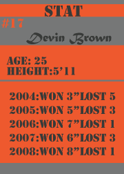
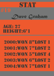
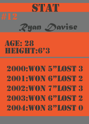
This is my 3RD trading card for a booklet package i'm currently working on. The story behind my current project is about 3 fighters who happen to be addicts and convicts, they all have anger built up inside that needs to be release and they take it out in the ring. they then happen to be three of the best fighters of their time.
Monday, March 25, 2013
Christmas Post Card#FIRST POST OF THE WEEK.
This is a post card i have been working on, i'm going to include it into my booklet package i'm currently working on.
Friday, March 22, 2013
#PUZZLE GAME: 5TH POST OF THE WEEK!
Can you help Dave get to his wife?
This is a puzzle game i created. it is part of a booklet package "The FIGHTERS Collection" i'm currently working on. The story behind this project is about 3 fighters, who happen to be addicts and convicts, they all have anger built up inside that needs to be release and they all take it out in the boxing ring. They then happened to found love and became better in many other aspect of their lives. They also became three of the biggest and famous fighters of their time.
Dave who is an addict who needs help to find a place of comfort and love, his wife is one of the very few people who can actually get him to understand it is okay to show love. Can you help Dave get to his wife.?
#PACKAGING DESIGN: BACK COVER OF THE VIDEO GAME#4TH POST OF THE WEEK.
I got most of my inspiration from "FAR CRY VENGEANCE" for the Wii. I created everything from scratch, then apply all my own art works to it.
Wednesday, March 20, 2013
Tuesday, March 19, 2013
#VIDEO GAME PACKAGING DESIGN WITH CD#2ND POST OF THE WEEK.
Just showing my progress. This want a require piece but i did it in regards of getting more experience and to get better with the graphic deign and packaging.
Monday, March 18, 2013
#VIDEO GAME PACKAGING DESIGN# FIRST POST OF THE WEEK.
This is just a packaging design, its not an actual video game i am working on, but i must say i had it in mine to create my own action genre video game.
Everything except the mountain was created by me, i created the planes in Maya, and the other 4 wheel drive trucks in Photoshop also to be on the safe side, or to be a original. i'm going to create the mountain foreground on my own in Photoshop.
Friday, March 15, 2013
Thursday, March 14, 2013
#PACKAGING DESIGN#4TH POST OF THE WEEK.
This is just a remake of the Irish Spring soap. I come up with my own name and logo for this soap box template design.
Wednesday, March 13, 2013
#POST CARD# PROMOTING MY SCHOOL# 3RD POST OF THE WEEK.
This is just two piece of my art work that i have created last year, i decided to put theses two pieces together and created a post card promoting, The College of Westchester.
Tuesday, March 12, 2013
THE BOOKLET COVER IMAGE# FIRST POST OF THE WEEK.
This the piece of imagery i am planing on using for the cover of the booklet package for "The FIGHTERS Collection". #work in progress.
Friday, March 8, 2013
#3D MODELING PROJECT#5TH POST OF THE WEEK.
Wednesday, March 6, 2013
Tuesday, March 5, 2013
Monday, March 4, 2013
#TRADING CARDS#1 FIRST POST OF THE WEEK
This is a trading card for a booklet package i'm currently working on. the story behind my current project is about 3 fighters who happen to be addicts and convicts, they all have anger built up inside that needs to be release and they take it out in the ring. they then happen to be three of the best fighters of their time.
Friday, March 1, 2013
#3D MODELING# 5th POST OF THE WEEK.
This was a project i did in my 3D modeling class, i created a fighter jet. I had to say this class is my most challenging class so far, but i'm slowly but surely mastering it.
Wednesday, February 27, 2013
Tuesday, February 26, 2013
#INTERIOR and PERSPECTIVE DESIGN# 3RD POST OF THE WEEK
Lately i develop a likening for interior design and perspective drawing and i'm not to good on perspective, so i tend to do more and more each week.
#BLOODBATH#SCENE 3#*SECOND POST OF THE WEEK*
THE COLOR VERSION SCENE 3. I got this concept idea and inspiration from a movie i was watching on Netflix call "Act of Valor" The movie is about a mission of rescuing a kidnapped CIA agent from a lethal terrorist cell falls to an elite squad of Navy Seals Active duty Seals play the lead fighting roles in a saga based on actual events from their service. its a great action movie that show some cool gun battle.
Monday, February 25, 2013
#BLOODBATH#SCENE 2#*FIRST POST OF THE WEEK*
THE COLOR VERSION> I got this concept idea and inspiration from a movie i was watching on Netflix call "Act of Valor" The movie is about a mission of rescuing a kidnapped CIA agent from a lethal terrorist cell falls to an elite squad of Navy Seals Active duty Seals play the lead fighting roles in a saga based on actual events from their service. its a great action movie that show some cool gun battle.
Thursday, February 21, 2013
#NEW CONCEPT ART# 4TH POST OF THE WEEK!t
 I got this concept idea and inspiration from a movie i was watching on Netflix call "Act of Valor" The movie is about a mission of rescuing a kidnapped CIA agent from a lethal terrorist cell falls to an elite squad of Navy SEALs. Active duty SEALs play the lead fighting roles in a saga based on actual events from their service. its a great action movie that show some cool gun battle.
Wednesday, February 20, 2013
#FREESTYLE SKETCHING#LIL WAYNE#
This is just a random sketch i did of lil wayne, this is not one of my best sketches and its not complete either.there is a little bet behind this sketch, i was dared by this girl, a friend, that i could drew lil wayne, and she gave me an hour, but it took no more than half an hour to do sketches like this.
Monday, February 18, 2013
#FREE SOSA#
#FREE SOSA# this is my first pose
of the week, this is a sketch of Chief Keef, Who is also known as SOSA, he is a
new hip hop artist who happened to be the youngest and one of my favorite new
artist. I did this sketch out of boredom a few weeks ago.
Friday, February 15, 2013
#BEFORE AND AFTER#PERSPECTIVE#
This is another concept art project i did at the very beginning of my semester, for one of my Studio Art project, it was a home work assignment in which i had to drew a image, that did look flat or plain, which means i had to include perspective and shading. the image had to include a person,book and something to that represent the College of Westchester, This was a challenging piece for me, because i didn't know anything about perspective and i knew little to nothing about shading, the actual pencil drawing was shaded to a point where i had to clean it up in Photoshop. PLEASE CRITIQUE...
Tuesday, February 12, 2013
#SIMPLE EXTERIOR DESIGN#
This is also a old drawing i did on perspective, this is a two point perspective drawing, i did the street signs and street lights in illustrator n then dragged them to Photoshop.
#SIMPLE INTERIOR DESIGN#
This is one of my first drawing on perspective,and this is a one point perspective drawing. I came across this piece in my old art collection and decided to do a simple interior design. This is actually one of my very first interior design as well. i first drew the image out with pencil then i scanned it and then i applied the shading and coloring all in Photoshop. I also embedded my logo in one of the window.
Friday, February 8, 2013
Wednesday, February 6, 2013
#THE MAN IN THE WOODS#
THIS IS MY 3RD POST OF THE WEEK.
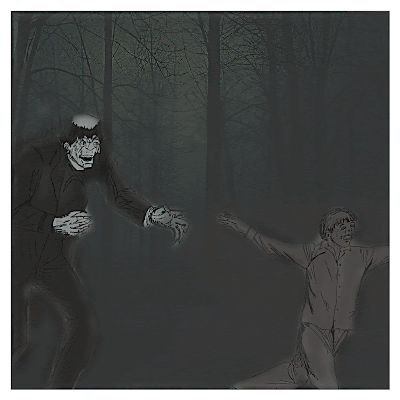
This is two random sketches that i merge together and turn into a concept art piece. These were two sketches with two different setting that i drew 2 years ago. The scary looking guy in this sketch is Bob, and the little boy is Ryan. When i first drew this sketch of Ryan, he was running to his father but i some how miss-place the other section. I then twisted the concept behind the story, and add (Bob)the scary looking guy to it. This is just a tease of what to expect.
#MY WORK SPACE#
This picture show where i do most of my studying and drawing,i don't have must to show.I sometimes draw on my bed,but i mostly use this table. All of the things that influence me to draw:Music is the main thing,times just put on my headphones and just zone out. For some apparent reason i like to draw in dim light, i also have some books that i use as reference, along with the internet.The anatomy book I got from Studio Art during my first semester and this book call "The World of the Arts" is the books i used most for reference ,very helpful. i seriously don't have much things that inspired me to draw, but i do it often as i can. i sometimes would just start watching a movie on Netflix and then just grab my art supplies and start drawing with the movie going on without watch it;just listening to it in the background. i really don't watch cartoon that much so i cant really draw cartoon characters very well,my style of drawing is more of realism. i am not so good with the poses and motion art, but i plan on getting some manikins to help me improve in that area. i only used those marker and color pencils in a few of my art pieces, i love to use the no 2 pencil and my fingers to get that texture in my shading.
Subscribe to:
Comments (Atom)


